Text Widgets
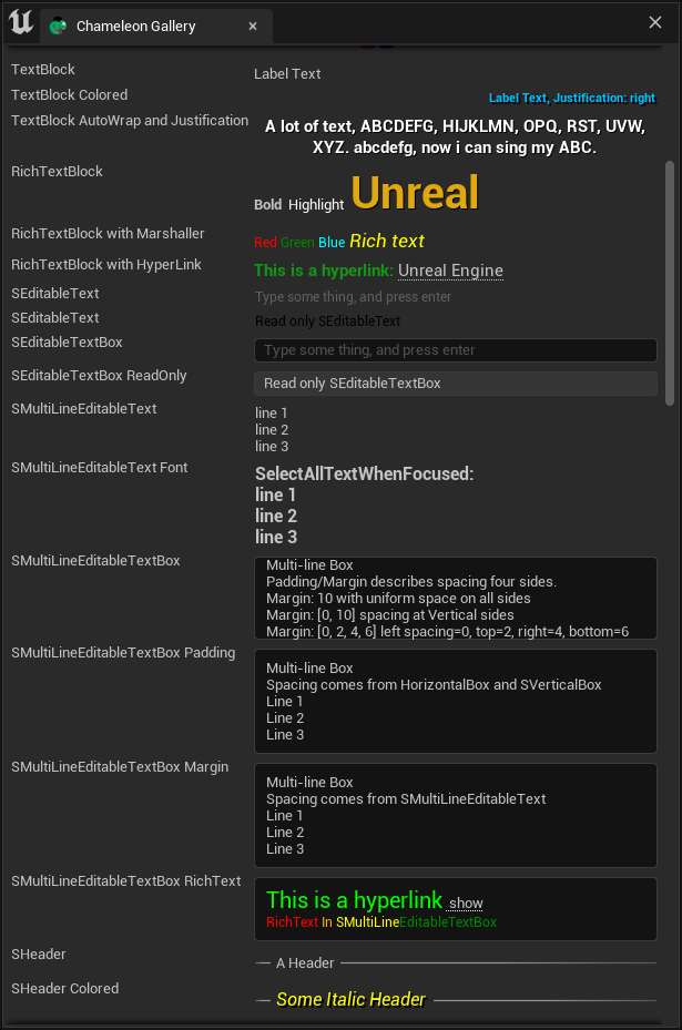
- STextBlock
- SEditableText
- SEditableTextBox
- SMultiLineEditableText
- SMultiLineEditableTextBox
- SRichTextBlock
Other Text Widget:
- SHeader
SHeader is usually used to display text. It is a composite widget with horizontal lines on both sides. The text comes from the "STextBlock" within it. If we replace the "STextBlock" in the example below with an "SImage", we can display an image or even insert more complex layout widgets.
    "SHeader":
    {
        "Content":
        {
            "STextBlock": { "Text": "A Header", "Justification": "Center"}
        }
    }
Differences
- "STextBlock" is used only to display text, and users cannot modify its contents.
- "SEditableText" has a similar appearance to "STextBlock", but users can edit its contents.
- "SMultiLineEditableText" supports user line breaks using spaces and is the "line breakable" version of "SEditableText".
- "SEditableTextBox" and "SMultiLineEditableTextBox" are framed versions of "SEditableText" and "SMultiLineEditableText", respectively.
Comparison Table
| Slate | Editable | Frame Box | Multi-Line | Rich Text | Padding | Margin | ColorAndOpacity | |
|---|---|---|---|---|---|---|---|---|
| STextBlock | No | No | No | No | Yes | Yes | ||
| SEditableText | Yes | No | No | No | No | Yes | ||
| SEditableTextBox | Yes | Yes | No | Yes | No | Yes | --> : SBorder | |
| SMultiLineEditableText | Yes | No | Yes | No | Yes | N | ||
| SMultiLineEditableTextBox | Yes | Yes | Yes | Yes | yes | Yes | Yes | -- > : SBorder |
| SRichTextBlock | No | No | No | Yes | No | Yes | N |
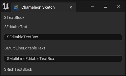
    "SVerticalBox":
    {
        "Slots": [
            {
                "AutoHeight": true,
                "Padding": 8,
                "STextBlock": {
                    "Text": "STextBlock"
                }
            },
            {
                "AutoHeight": true,
                "Padding": 8,
                "SEditableText":
                {
                    "Text": "SEditableText"
                }
            },
            {
                "AutoHeight": true,
                "Padding": 8,
                "SEditableTextBox":
                {
                    "Text": "SEditableTextBox"
                }
            },
            {
                "AutoHeight": true,
                "Padding": 8,
                "SMultiLineEditableText":
                {
                    "Text": "SMultiLineEditableText"
                }
            },
            {
                "AutoHeight": true,
                "Padding": 8,
                "SMultiLineEditableTextBox":
                {
                    "Text": "SMultiLineEditableTextBox"
                }
            },
            {
                "AutoHeight": true,
                "Padding": 8,
                "SRichTextBlock":
                {
                    "Text": "SRichTextBlock"
                }
            }
        ]
    }
TIP
All text widgets can use "\n" for line breaks, e.g., "line 1\nline2"
Colors
There are various ways to set colors in Slate text widgets, which can be confusing.
| Slate | bCompoundWidget | ColorAndOpacity | ForegroundColor | BackgroundColor |
|---|---|---|---|---|
| STextBlock | N | Yes | N | N |
| SEditableText | N | Yes | N | N |
| SEditableTextBox | Yes | Yes | Yes | Yes |
| SMultiLineEditableText | N | N | N | N |
| SMultiLineEditableTextBox | Yes | Yes | Yes | Yes |
| SRichTextBlock | N | N | N | N |
ColorAndOpacity
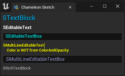
The "ColorAndOpacity" on the widget can control the overall color of the widget and can also be used to set the text color.
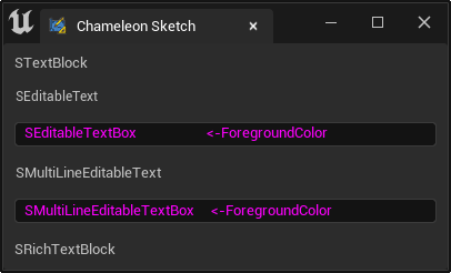
    "SEditableTextBox":
    {
        "ForegroundColor": [1, 0, 1, 1],
        "Text": "SEditableTextBox                     <-ForegroundColor"
    }
Note
- "ColorAndOpacity" affects not only the foreground color but also the background color, such as when text is selected.
- For widgets that do not have their own "ColorAndOpacity", the "ColorAndOpacity" of the parent widget can also be used to affect the text.
    "SVerticalBox":
    {
        "Slots": [
            {
                "AutoHeight": true,
                "Padding": 4,
                "STextBlock":
                {
                    "Text": "STextBlock",
                    "ColorAndOpacity": [0, 0.5, 1, 1],
                    "Font": {
                        "Style": "FEditorStyle",
                        "StyleName": "FontAwesome.16"
                    },
                    "ShadowOffset": [2, 2],
                    "ShadowColorAndOpacity": [0, 0, 0, 0.75]
                }
            },
            {
                "AutoHeight": true,
                "Padding": 4,
                "SEditableText":
                {
                    "ColorAndOpacity": [1, 1, 1, 1],
                    "Font": {
                        "Style": "FCoreStyle",
                        "StyleName": "DefaultFont.Bold.11"
                    },
                    "HintText": "Readonly Text Can't Be Edit.",
                    "Text": "SEditableText"
                }
            },
            {
                "AutoHeight": true,
                "Padding": 4,
                "SEditableTextBox":
                {
                    "ColorAndOpacity": [0, 1, 1, 1],
                    "Font": {
                        "Style": "FCoreStyle",
                        "StyleName": "DefaultFont.Bold.11"
                    },
                    "Text": "SEditableTextBox"
                }
            },
            {
                "AutoHeight": true,
                "Padding": 4,
                "SMultiLineEditableText":
                {
                    "Text": "SMultiLineEditableText\n\tColor is NOT from ColorAndOpacity",
                    "TextStyle": {"Style": "FEditorStyle", "StyleName": "AnimViewport.WarningText"}
                }
            },
            {
                "AutoHeight": true,
                "Padding": 4,
                "SMultiLineEditableTextBox":
                {
                    "Text": "SMultiLineEditableTextBox",
                    "ColorAndOpacity": [0.5, 0.5, 1, 1],
                    "Font": {
                        "Style": "FCoreStyle",
                        "StyleName": "DefaultFont.Italic.12"
                    }
                }
            },
            {
                "AutoHeight": true,
                "Padding": 4,
                "SRichTextBlock":
                {
                    "Text": "SRichTextBlock"
                }
            }
        ]
    }
ForegroundColor
The "ForegroundColor" property can be used to set the text color in the input box text widgets SEditableTextBox and SMultiLineEditableTextBox.
In fact, all CompoundWidgets have a "ForegroundColor" property.
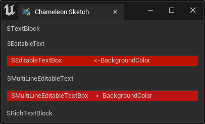
BackgroundColor
Similarly, SEditableTextBox and SMultiLineEditableTextBox also have a "BackgroundColor" property, which can be used to set the background color of the input box.
    "SEditableTextBox":
    {

        "BackgroundColor": [100, 0, 0, 1],
        "Text": "SEditableTextBox                     <-BackgroundColor"
    }
Note
- The color value in the code above is
[100, 0, 0, 1], which is a red color far beyond[1, 0, 0, 1]. - UE5 uses a dark mode, and the background color of widgets is close to black, so multiplying it by a color value greater than 1 results in a color close to black.
- If you don't want to use the hacky method of
[100, 0, 0, 1]to modify the color, you can also modify the background color through Style and then control it with "BackgroundColor".
Styles
In text widgets, there are three different styles:
- "Font" to control the font of the widget:
FontStyle - "TextStyle" to control the text style of the widget:
FTextBlockStyle - "Style" to control the overall style of the widget:
FEditableTextStyle
Text Widget
| Slate | bCompoundWidget | Font | TextStyle | Style |
|---|---|---|---|---|
| STextBlock | N | Yes | Yes | N |
| SEditableText | N | Yes | Yes | N |
| SEditableTextBox | Yes | Yes | Yes | Yes |
| SMultiLineEditableText | N | Yes | Yes | N |
| SMultiLineEditableTextBox | Yes | Yes | Yes | Yes |
| SRichTextBlock | N | N | Yes | N |
Font
As shown in the example above, we can specify the font in the text through "Font".
        "Font": {
            "Style": "FCoreStyle",
            "StyleName": "DefaultFont.Bold.11"
        }
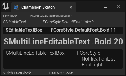
The "SRichTextBlock" control does not have a "Font" property; its font can be specified directly in the rich text content
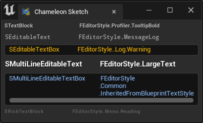
TextStyle
"TextStyle" is a superset of "Font". It not only widgets the font of the text but also the color of the text.
    "STextBlock": {
        "Text": "STextBlock",
        "TextStyle": {
            "Style": "FEditorStyle",
            "StyleName": "Profiler.TooltipBold"
        }
    }
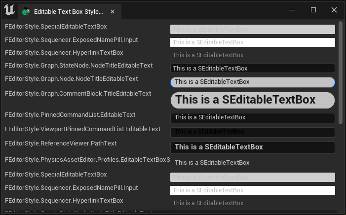
Style
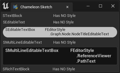
"SEditableTextBox" and "SMultiLineEditableTextBox" have a "Style" property, which not only widgets the text but also the overall style of the widget.
    "SEditableTextBox":
    {
        "Text": "SEditableTextBox",
        "Style": {
            "Style": "FEditorStyle",
            "StyleName": "Graph.Node.NodeTitleEditableText"
        }
    }
RichText
If you need to use multiple colors or fonts within a single control, you can use RichText. RichText provides more convenient and rich settings.
- SMultiLineEditableText
- SMultiLineEditableTextBox
- SRichTextBlock
Some widgets that have not appeared in this article also support rich text.
- SListView SListView
Summary
- "ColorAndOpacity" and "ForegroundColor" can control the text color; various preset Styles can be used to control the text appearance.
- Using Font and color to control text style is more intuitive than using "TextStyle" and "Style".
- The styles of various widgets can be viewed in the engine's SlateEditorStyle.cpp, StarshipStyle.cpp, and CoreStyle.cpp Editor Style Gallery
| Slate | bCompoundWidget | ColorAndOpacity | ForegroundColor | Font | TextStyle | Style |
|---|---|---|---|---|---|---|
| STextBlock | N | Yes | N | Yes | Yes | N |
| SEditableText | N | Yes | N | Yes | Yes | N |
| SEditableTextBox | Yes | Yes | Yes | Yes | Yes | Yes |
| SMultiLineEditableText | N | N | N | Yes | Yes | N |
| SMultiLineEditableTextBox | Yes | Yes | Yes | Yes | Yes | Yes |
| SRichTextBlock | N | N | N | N | Yes | N |