In previous introductions, we have used "Style" and "Brush" many times. For example, the JSON code below means: Find the Brush named "ToolPanel.DarkGroupBorder" from "FEditorStyle" and assign it to the "BorderImage" attribute of SBorder.
BorderImage
"SBorder": {
    "Padding": 3,
    "BorderImage": {
        "Style": "FEditorStyle",
        "Brush": "ToolPanel.DarkGroupBorder"
    },
    "Content":{
        ...
    }
}
The content in the JSON above is equivalent to the following C++ code:
SNew(SBorder)
.Padding(FMargin(3))
.BorderImage(FEditorStyle::GetBrush("ToolPanel.DarkGroupBorder"))
[
    //...
];
TIP
All Styles in this article can be found in the DefaultPythonSource repo@github repo@github auto_gen.
Other attributes that can be obtained through Style for editor presets include:
Image Category
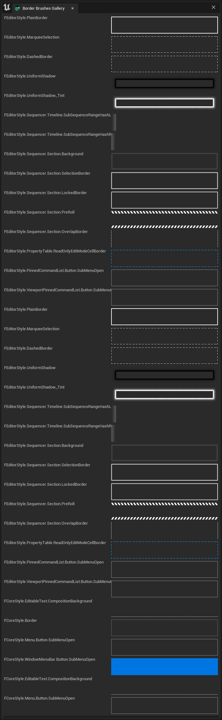
BorderImage of SBorder
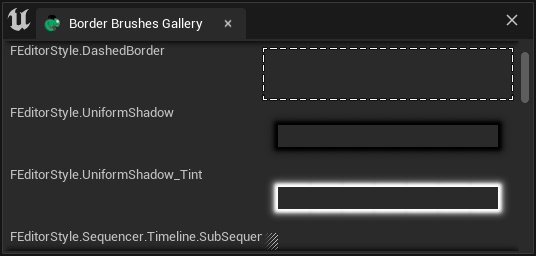
"SBorder": {
    "BorderImage": {
        "Style": "FCoreStyle",
        "Brush": "ToolPanel.GroupBorder"
    },
    "Content": {
        ...
    }
}
A complete interface screenshot can be found here. This is a 700x2000+ image. For information on how to save a complete interface screenshot, seeTake UI Snapshot and Capture Chameleon Window
Border Brushes Gallery (707x2296)
Image of SImage
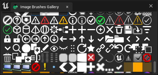
When specifying an ImageBrush, use the "Image" field and also specify the "Style" and "Brush" fields within it.
"SImage": {
     "DesiredSizeOverride": [32, 32],
     "Image":{
        "Style": "FEditorStyle",
        "Brush": "Perforce.CheckedOut"
     }
}
TIPDesiredSizeOverride is an attribute added in UE5. In UE4, if you want to limit the image size, you can wrap an SBox around the SImage. For details, please refer to the Shelf tool that comes with TAPython UE4 Edition.
Full Image of Image Brush Gallery (664x9248)
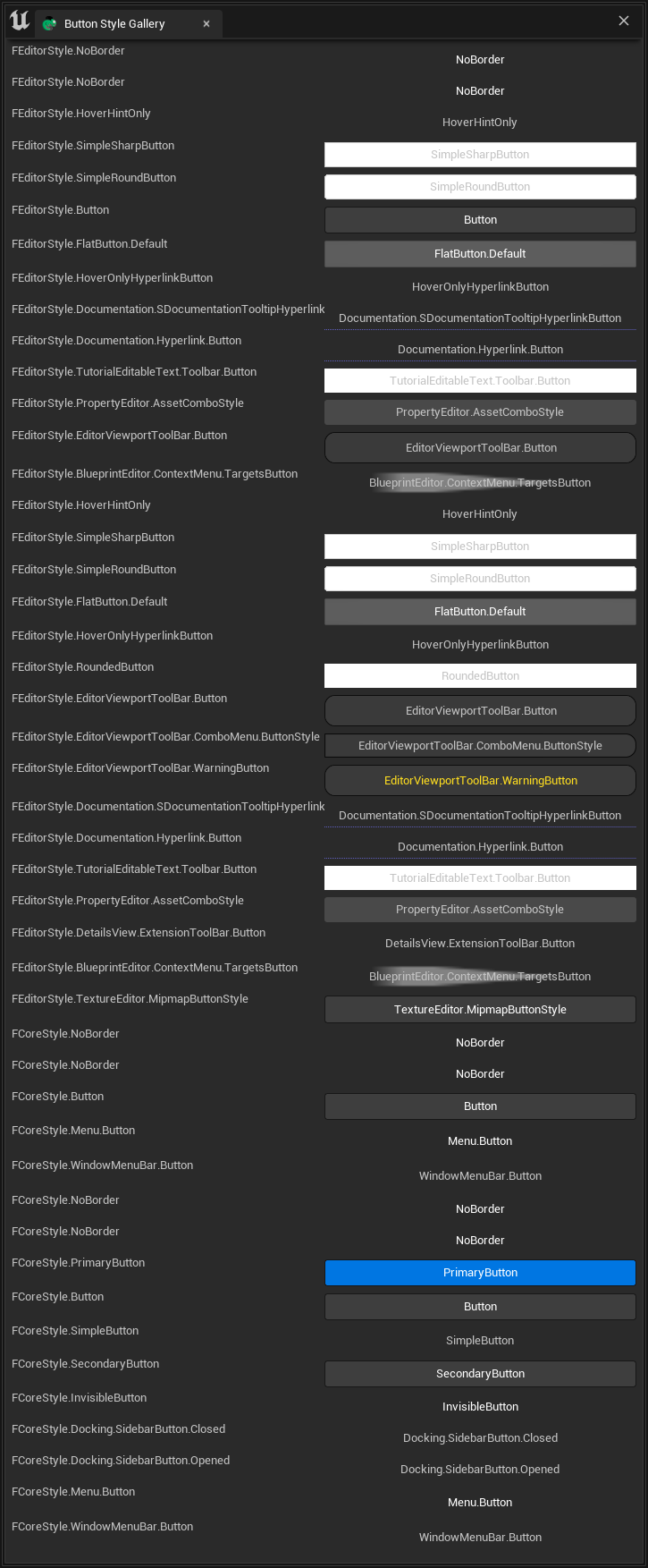
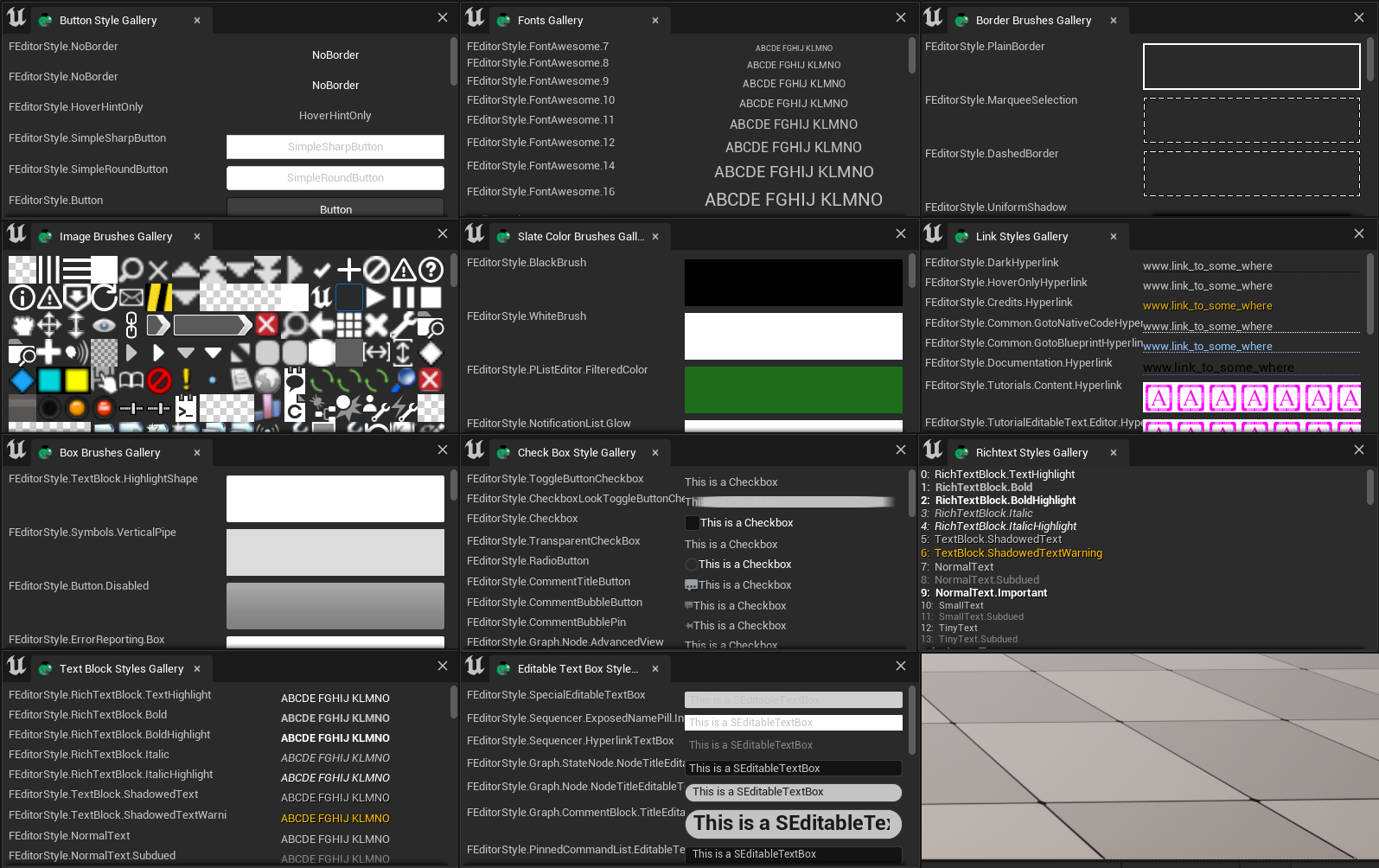
Button Style Category
ButtonStyle of SButton
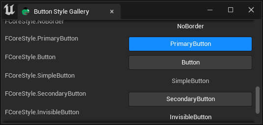
The "ButtonStyle" field is used to specify the SButton button style, such as the button style in the Shelf tool:
Shelf.json
"SButton": {
    "ButtonStyle":
    {
        "Style": "FEditorStyle",
        "StyleName": "HoverHintOnly"
    },
    "ContentPadding": [16, 0]
}
Full Image of Button Style Gallery (725x1753)
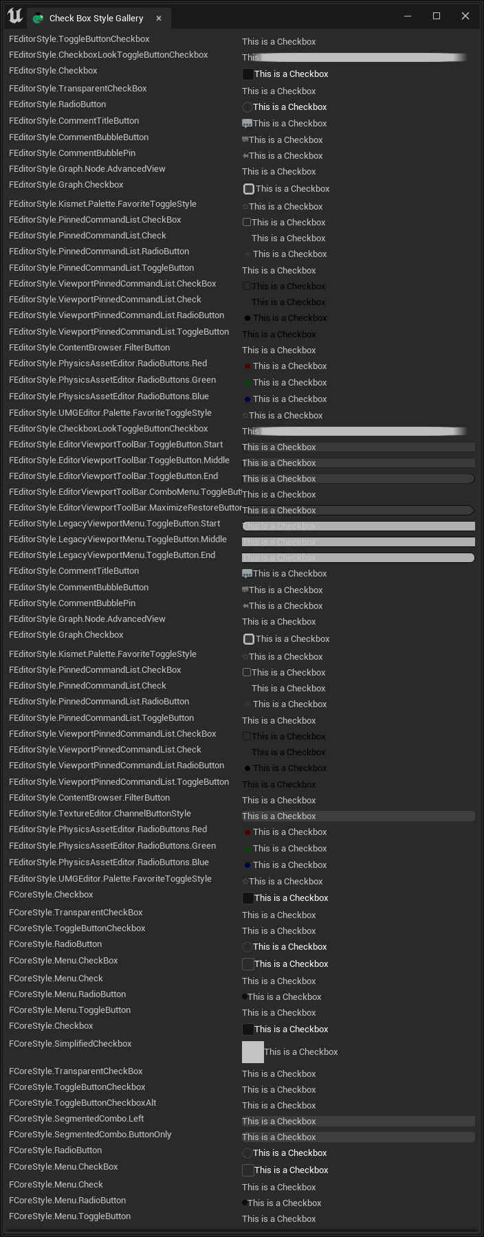
CheckBoxStyle of SCheckBox
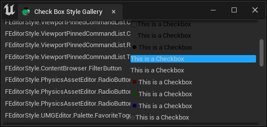
The "CheckBoxStyle" field is used to specify the SCheckBox style:
"SCheckBox":
{
    "Aka": "RiggingCheckbox",
    "Padding": [10, 2],
    "CheckBoxStyle": {
        "Style": "FCoreStyle",
        "StyleName": "ToggleButtonCheckboxAlt"
    },
    "HAlign": "Center",
    "Content": {
        "STextBlock": {
            "Text": "Rigging", "Font": {"Style": "FCoreStyle", "StyleName": "DefaultFont.Bold.11"} }
        },
    "IsChecked": true,
    "OnCheckStateChanged": "chameleon_control_rig.checkbox_click(%, id=0)"
}
Full Image of Check Box Style Gallery (704x1800)
Text Style Category
Font of STextBlock
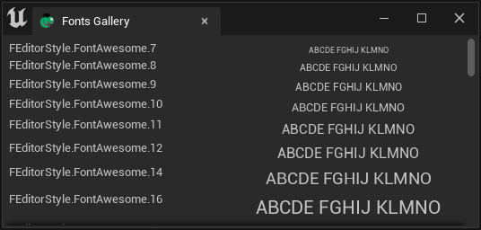
The "TextStyle" field is used to specify the STextBlock text style.
"STextBlock": {
    "Text": "Some Text",
    "Justification": "Center",
    "TextStyle": {
        "Style": "FEditorStyle",
        "StyleName": "TextBlock.ShadowedTextWarning"
    }
}
Full Image of Fonts Gallery (707x5337)
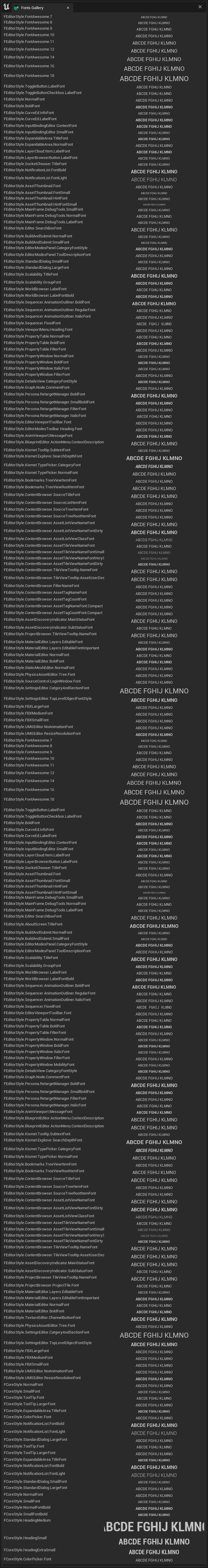
For more information about text, see Texts
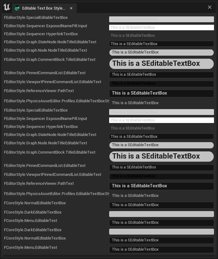
Style of SEditableTextBox
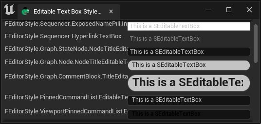
"SEditableTextBox": {
    "Style":{
        "Style": "FEditorStyle",
        "StyleName": "Graph.CommentBlock.TitleEditableText"
    },
    "Text": "This is a SEditableTextBox"
}
Here, the "Style" field has no prefixes or suffixes, and it refers to the style of SEditableTextBox.
Full Image of Editable Text Box Gallery (707x838)
Style of STextBlock
"STextBlock": {
    "Text": "ABCDE FGHIJ KLMNO",
    "Justification": "Center",
    "TextStyle": {
        "Style": "FEditorStyle",
        "StyleName": "TextBlock.ShadowedTextWarning"
    }
}
TIP
There is also a "TextStyle" field in SButton, which can be used to specify the style of the text specified in the "Text"field within the button.
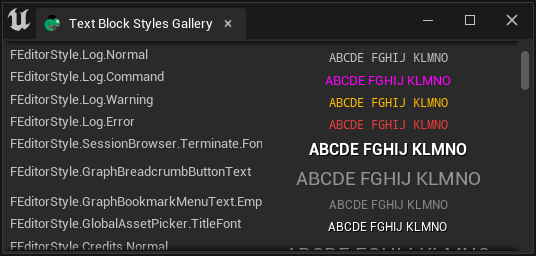
Full Image of Text Block Gallery (706x9802)
Style of SRichText
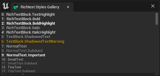
The style in SRichText is not directly specified by the "Style" field, but by the tags in the "Text" field. For example:
"SRichTextBlock":
{
    "Text": "<RichTextBlock.Bold>Bold</>  <RichTextBlock.TextHighlight>Highlight</>  <Credits.H2>Unreal</>"
}
Full Image of Richtext Style Gallery (706x5725)
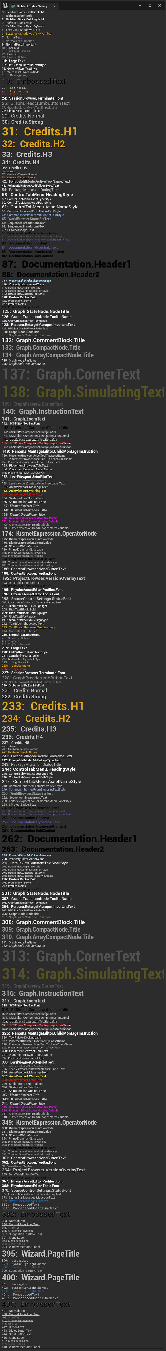
SHyperlink
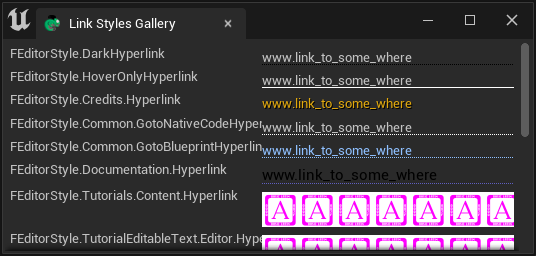
Full Image of Hyperlink Styles Gallery (706x662)
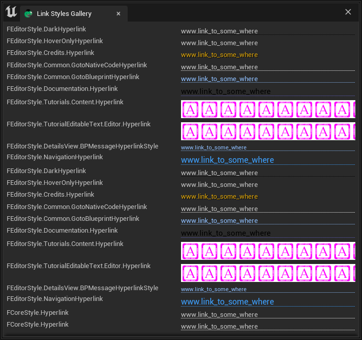
TextStyle
Style of Color Brush
"SHyperlink": {
    "Style":{
        "Style": "FEditorStyle",
        "StyleName": "Credits.Hyperlink"
    },
    "Text": "www.tacolor.xyz"
}
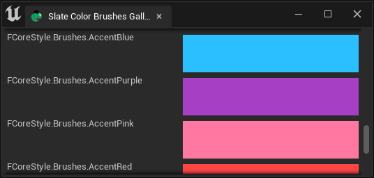
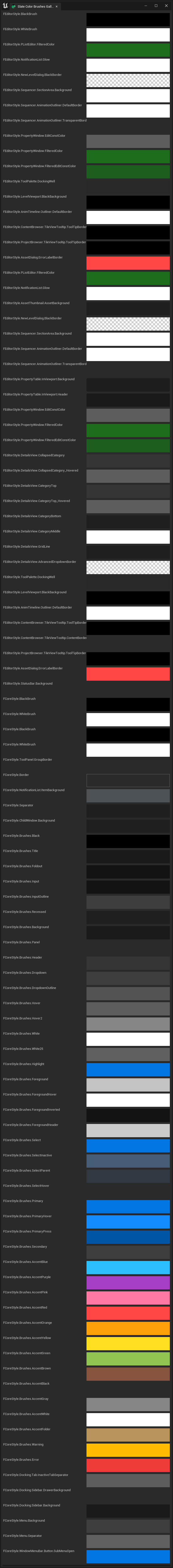
Full Image of Color Brushes Gallery (706x6388)
Style of Box Brush
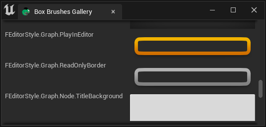
Below, the "BorderImage" field in SBorder is used to display the Box Brush style. Since a size [50px, 50px] SSpacer is specified as a placeholder widget in SBorder, the "BorderImage" is the style of the entire widget.
"SBorder":
{
    "BorderImage":{
        "Style": "FEditorStyle",
        "Brush": "PListEditor.HeaderRow.Background"
    },
    "Content":{
        "SSpacer":{"Size": [50, 50]}
    }
}
Full Image of Box Brush Gallery (699*27468)
Style Gallery
We can open the Style Gallery in the editor by clicking the "Launch Editor Style Galleries" button at the bottom of theChameleon Gallery tool.
You can obtain all the .json files from the DefaultPythonSource repo@github, and place them in
Common Styles
TAPython supports the following three styles:
- FEditorStyle
- FCoreStyle
- FAppStyle
TIP
FAppStyle is only available in UE5.
How to Find Styles
There may be slight differences in the available Styles in different versions of the UE engine, but most Styles are consistent. We can find the styles we need by searching directly in the Unreal Engine source code, such as:
\Engine\Source\Editor\EditorStyle\Private\SlateEditorStyle.cpp\Engine\Source\Editor\EditorStyle\Private\StarshipStyle.cpp
In these two large C++ files, we can see the names and types of various editor Styles registered.
Related References
FEditorStyle in ue5.1