Lead by example, press down before the command, and release after the command
As the most commonly used buttons, buttons can also make various different changes. In fact, the initial prototype of TAPython was a button and an input box. As long as we can execute a line of code, we can grow arbitrarily.
Color
In Color of SButton we introduced the usage of color fields related to SButton, including:
- ButtonColorAndOpacity
- ColorAndOpacity
- ForegroundColor
Font
TextSytle
The "Text" field in SButton can specify the text on the button, and the "TextStyle" field is used to specify the style of the text.
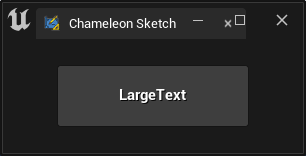
"SButton":
{
    "ContentPadding": [50, 20],
    "Text": "LargeText",
    "TextStyle": {
        "Style": "FEditorStyle",
        "StyleName": "LargeText"
    }
}
Text Alignment
When the size of the button is displayed in the size of adjacent or parent widgets, such as "VAlign": "Fill"
When using the "Text" field to set the display text for the SButton, the text is centered. If you are using the "Content" field with "STextBlock", you can adjust it using "HAlign" and "VAlign".
"SButton": {
    "Text": "PlaceHolder Button",
    "HAlign": "Center",
    "VAlign": "Center"
}
TIP
If there is content in the "Content" field of the button, the content in the "Content" field will be displayed preferentially instead of the content in the "Text" field.
Other available "TextStyle" can be found instyle-of-stextblock
OnClick
We know that the content in the "OnClick" field of SButton will be executed when the button is clicked. There have been several introductions in previous examples, such as the Minimal Example.
Widget Path Placeholder
One thing to mention here is that there is a variable placeholder in OnClick: %widgetPath. At runtime, this variable will be replaced with the Widget path of the currently clicked button.
For example, the "SnapShot" button in Chameleon Gallery has the path /SBorder/Content/SScrollBox/Slots_0/SGridPanel/Slots_127/SHorizontalBox/Slots_1/SButton
This path can also be seen in PyCharm
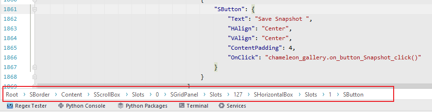
With this Widget path, when we use the same External Json file multiple times in one interface, we can use this variable to determine which button was clicked.
Content
Since the "Content" field allows us to use child widgets as the display content of the button, we can, of course, use SImage, SRichTextBlock and other widgets to enrich our buttons.
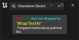
"SButton":
{
    "Text": "LargeText",
    "TextStyle": {
        "Style": "FEditorStyle",
        "StyleName": "LargeText"
    },
    "Content": {
        "SRichTextBlock": {
            "Text": "<RichText.red>Red</> <RichText.green>Green</> <RichText.cyan>Rich text Wrapped by</><TextStyle FontFamily=\"Roboto\" FontSize=\"13\" FontStyle=\"Italic\" FontColor=\"(R=1, G=1,B=0,A=1)\">  'WrapTextAt'</>\n Torquent nostra lacus pulvinar leo.",
            "AutoWrapText": true,
            "Justification": "Left",
            "WrapTextAt": 200,
            "WrappingPolicy": "AllowPerCharacterWrapping",
            "Marshaller": "ChameleonRichText"
        }
    }
}
Extra
In fact, we can put any widget in the button, such as SHorizontalBox, or even an SWebBrowser to display a web page.
Here are a few common applications:
Combination Buttons
Placing multiple widgets in the Content can enrich the display content of the button. For example, in the following example, both icons and text are displayed in the button.
Since there can only be one widget in Content, we need to use SHorizontalBox to wrap multiple widgets. The SImage used to display icons and the STextBlock used to display text are child widgets of SHorizontalBox.
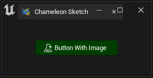
"SButton":
{
    "HAlign": "Center",
    "ContentPadding": 6,
    "ButtonColorAndOpacity": [0, 1, 0, 1],
    "ForegroundColor": [1, 1, 1, 1],
    "ToolTipText": "This is a button with image and Text",
    "OnClick": "print('Button clicked.')",
    "Content": {
        "SHorizontalBox": {
            "Slots": [
                {
                    "AutoWidth": true,
                    "SImage": {
                        "Image": {
                            "Style": "FEditorStyle",
                            "Brush": "AutomationTools.TestAutomation"
                        }
                    }
                },
                {
                    "Padding": [5, 0],
                    "STextBlock": {
                        "Text": "Button With Image"
                    }
                }
            ]
        }
    }
}
In the code above, the SImage uses an icon named AutomationTools.TestAutomation from EditorStyle. More information about EditorStyle can be found in Editor Style Gallery; more information about SImage can be found in Use Images and Image Brush and Modify SImage content and Set Pixels to RenderTarget in Unreal Engine.
Shared Background
When multiple buttons need to share a background, such as in the following image of a map editor, buttons for tile operations share the same background.
In this case, we can use SOverlay to stack the background and button groups together. Detailed introduction and sample JSON code can be found in Canvas Layout
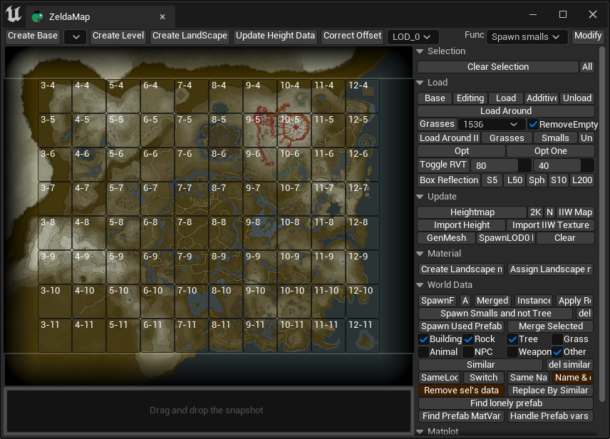
"SBox": {
    "HeightOverride": 480,
    "WidthOverride": 576,
    "Content": {
        "SOverlay": {
            "Slots": [
                {
                    "SImage": {
                        "Aka": "AImage",
                        "ImagePath": "Images/zelda_game_map.png"
                    }
                },
                {
                    "SVerticalBox": {
                        "Slots": [
                            {
                                "autoHeight": true,
                                "SBox": {
                                    "HeightOverride": 48,
                                    "Content": {
                                        "SBorder": {
                                        }
                                    }
                                }
                            },
                            {
                                "autoHeight": true,
                                "SBox": {
                                    "HeightOverride": 384,
                                    "Content": {
                                        "SHorizontalBox": {
                                            "Slots": [
                                                {
                                                    "autoWidth": true,
                                                    "SBox": {
                                                        "WidthOverride": 48
                                                    }
                                                },
                                                {
                                                    "autoWidth": true,
                                                    "SBox": {
                                                        "WidthOverride": 480,
                                                        "Content": {
                                                            "ExternalJson": "ZeldaWorldMapEditor_Buttons.json"
                                                        }
                                                    }
                                                }
                                            ]
                                        }
                                    }
                                }
                            },
                            ...
                        ]
                    }
                }
            ]
        }
    }
}
For example, in the code above:
- "SOverlay" stacks the background image and button group together; the specific content of the button group is in
"ZeldaWorldMapEditor_Buttons.json"and is imported through"ExternalJson". - "SBox" is used for placeholder; in the current version of TAPython, a more appropriate approach is to use SCanvas to move the entire - "SBox" containing the button group to [48, 48] as a whole. This is introduced in Canvas Layout for reference.
TIP
When our interface content becomes too mechanical and repetitive, we can also use Python scripts to generate interface JSON or part of the model.
Overlapping widgets
Different widgets can overlap, such as SEditableTextBox and SDropTarget. In the example below, a button and a progress bar overlap.
In Shelf Tools, the "SButton" and "SEditableText" are placed together, allowing the widget to have editable text and buttons. Users can trigger different operations by clicking the same position at different stages (triggering the button or entering the SEditableText editing state).
    "SOverlay": {
    "Slots": [{
            "SButton": {"ButtonStyle": {"Style": "FEditorStyle", "StyleName": "HoverHintOnly"}, "ContentPadding": [16, 0],
                "OnClick": "chameleon_shelf.on_button_click(id=0)",
                "Content": { "SImage": {"Aka": "Img_0", "ImagePathInPlugin": "Resources/PythonGreyIcon_40x.png", "ColorAndOpacity": [1,1,1,0.6]}}
            }
        },{
            "Padding": [0, 20, 0, 0],
            "SEditableText":{"Aka": "Txt_0", "Text": "", "ColorAndOpacity": [1,1,1,1], "Justification": "Right"}
        }
    ]
}