There are several color-related attributes in Widget widgets, such as ForegroundColor, ColorAndOpacity, BorderBackgroundColor, ButtonColorAndOpacity, and so on. Some of them can be easily confused. In this section, we will look at the differences between these attributes through examples.
SBorder
ForegroundColor
The foreground color is the color of the text within the widget.
ColorAndOpacity
ColorAndOpacity is the overall color (multiplicative) applied to the content within the widget. It will affect the color of the text mentioned above.
ColorAndOpacity is the most widely used color attribute, and many other widgets also have this attribute. It affects the color of its child widgets, so if there is no color attribute in the widget you want to modify, you can set it through the ColorAndOpacity of its parent widget.
TIP
Color overlay is calculated using the Multiple method, and the value can be greater than 1.
BorderBackgroundColor
BorderBackgroundColor is the background color, which for SBorder means the actual color of the border.
    "Root":{
        "SBorder": { "BorderImage":
            {
                "Style": "FEditorStyle", "Brush": "DashedBorder"
            },
            "ForegroundColor": [1, 0, 1, 1],
            "ColorAndOpacity": [1, 0.5, 0, 1],
            "BorderBackgroundColor": [0, 1, 0, 1],
            "Content": {
                "SHorizontalBox":
                {
                    "Slots": [
                        {
                            "STextBlock":
                            {
                                "Text": "Text Content"
                            }
                        },
                        {
                            "SButton": { "Text": "Placeholder B"}
                        }
                    ]
                }
            }
        }
    }
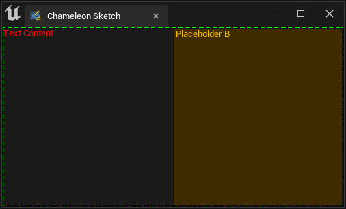
For example, in this case:
"ForegroundColor": [1, 0, 1, 1]: Purple"ColorAndOpacity": [1, 0.5, 0, 1]: Orange"BorderBackgroundColor": [0, 1, 0, 1]: Green
-
The color of the text "Text Content" is red (
ForegroundColor: Purple [1, 0, 1, 1] * ColorAndOpacity [1, 0.5, 0, 1] = Red [1, 0, 0, 1]) -
The background color of the button is orange, which comes from "ColorAndOpacity". In fact, it is also multiplied by the color of the button's own image.
-
The color of the button text is orange, coming from "ColorAndOpacity". The color of widgets other than direct text widgets in the widget is not affected by the "ForegroundColor" of SBorder.
-
The color of the border dotted line is the color of "BorderBackgroundColor".
SButton
SButton also has several color attributes: ColorAndOpacity and ButtonColorAndOpacity. It also supports Style and can contain other child widgets. Thus, the variations can be more diverse. Let's take a look at their differences.
For more information about SButton, please refer to this article: Buttons
ButtonColorAndOpacity
ButtonColorAndOpacitywill affect the color of the button itself, and it has a Multiple relationship with the button style inButtonStyle.
ColorAndOpacity
ColorAndOpacitywill affect both the text on the button and other widgets in Content, such as SImage.
ForegroundColor
ForegroundColorwill only affect the foreground content (text) of the button, and it will not affect the child widgets in Content.
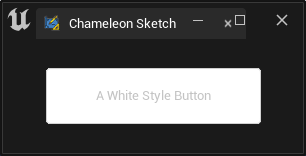
For a more intuitive understanding, let's look at the following example:
Starting with a white button, the SButton below uses "FEditorStyle.SimpleRoundButton", which is a white rounded button with gray text.
"Root":
{
    "SVerticalBox":
    {
        "Slots": [{
                "VAlign": "Center",
                "SHorizontalBox":{
                    "Slots": [
                        {
                            "HAlign": "Center",
                            "SButton":
                            {
                                "Text": "A White Style Button",
                                "ContentPadding": [50, 20],
                                "ButtonStyle":{
                                    "Style": "FEditorStyle",
                                    "StyleName": "SimpleRoundButton"
                                }
                            }
                        }
                    ]
                }
            }
        ]
    }
}
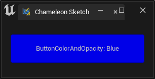
After setting "ButtonColorAndOpacity", the blue color [0, 0, 1, 1] is added (Multiple) to the button, and the text part is not affected.
"SButton":
{
    "Text": "ButtonColorAndOpacity: Blue",
    "ButtonColorAndOpacity": [0, 0, 1, 1],
    "ContentPadding": [50, 20],
    "ButtonStyle":{ "Style": "FEditorStyle", "StyleName": "SimpleRoundButton"}
}
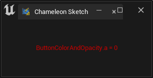
If we set the alpha value of the color to 0, the button itself becomes completely transparent, leaving only the text.
"SButton":
{
    "Text": "ButtonColorAndOpacity.a = 0",
    "ButtonColorAndOpacity": [0, 0, 1, 0],
    "ContentPadding": [50, 20],
    "ButtonStyle":{ "Style": "FEditorStyle", "StyleName": "SimpleRoundButton"}
}
Setting both ColorAndOpacity and ForegroundColor, as in the example below, with values of cyan [0, 1, 1, 1] and red [1, 0, 0, 1], respectively, the resulting text color is black after multiplication.
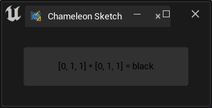
"SButton":
{
    "Text": "[0, 1, 1] * [0, 1, 1] = black",
    "ButtonColorAndOpacity": [1, 1, 1, 0.1],
    "ColorAndOpacity": [0, 1, 1, 1],
    "ForegroundColor": [1, 0, 0, 1],
    "ContentPadding": [50, 20],
    "ButtonStyle":{
        "Style": "FEditorStyle",
        "StyleName": "SimpleRoundButton"
    }
}
TIP
When the Content of an SButton contains content, only the content in Content is displayed, and the text in Text is not displayed.
In the example below, the button color is set to light yellow by "ButtonColorAndOpacity": [1, 1, 0.5, 1]. The color of the Python logo is multiplied by "ColorAndOpacity": [0, 1, 1, 1], thus losing all red color.
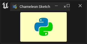
"SButton":
{
    "ButtonColorAndOpacity": [1, 1, 0.5, 1],
    "ButtonStyle":{
        "Style": "FEditorStyle",
        "StyleName": "SimpleRoundButton"
    },
    "ColorAndOpacity": [0, 1, 1, 1],
    "ContentPadding": [50, 20],
    "Content": {
        "SImage": {
            "Aka": "ImageInButton_A",
            "ImagePathInPlugin": "Resources/Icon128.png",
            "DesiredSizeOverride": [64, 64]
        }
    }
}
Text
The color of the text is described in more detail in Texts, which is recommended to be checked out.
Set Color with python
In Chameleon Data, TAPython provides the following three functions for setting colors:
set_color_and_opacity
Supported widgets:
- SScrollBox
- SCheckBox
- SSpinBox
- SColorPicker
- SDropTarget"
- SBreadcrumbTrail
- SThrobber
- SBorder
- SHeaderRow
- SSeparator
- SButton
- SHyperlink
- SMultiLineEditableTextBox
- SEditableTextBox
- SSearchBox
- STreeView
- SListView
- SListView
- SScrollBox
- SImage
- STextBlock
- SEditableText
- SProgressBar
set_button_color_and_opacity
As the name suggests, the supported widget is:
- SButton
set_color
This function is easy to misuse. In fact, its purpose is to set the color for the SColorBlock widget, not for other widgets.
Supported widgets:
- SColorBlock